On the upper east side of Manhattan, VAKOTA has recently completed a renovation to a 2,000 square foot apartment. Working alongside Courtney Lauren Interiors and IntraBuild Construction to completely gut and renovate the apartment under an extremely short 4-month timeline we turned a 2-bedroom apartment into a 3-bedroom, highly stylized luxury apartment – ensuring every inch was used to its potential.
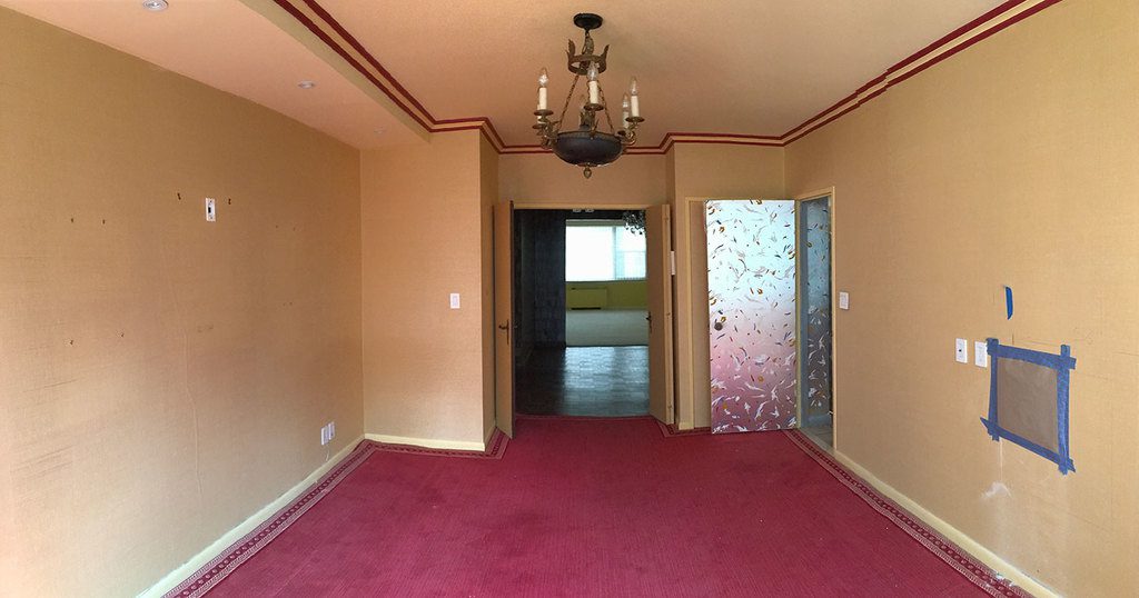
The previous interior design and décor in this 2-bedroom apartment had not been touched in around 30 years. It was a lively design that fit the previous owners Broadway lifestyle, but was a little out of touch and in need of a major update.
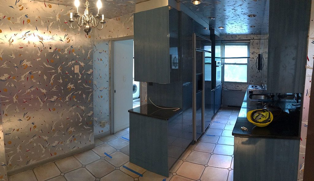
Before 
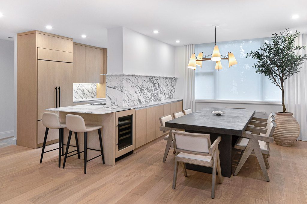
After
Apartment renovations can be complicated as one is stuck with fixed elements within the apartment footprint, such as structural columns, plumbing and electrical risers, and building renovation guidelines. As this was such a huge renovation, we went further than a simple interior redesign – we gutted the home completely, restructuring the layout to match the new owner’s lifestyle and updating the look and feel to suit their tastes.
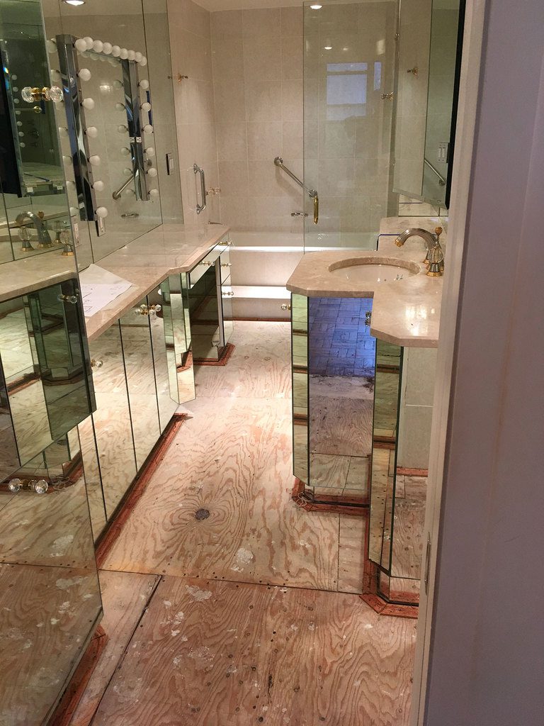
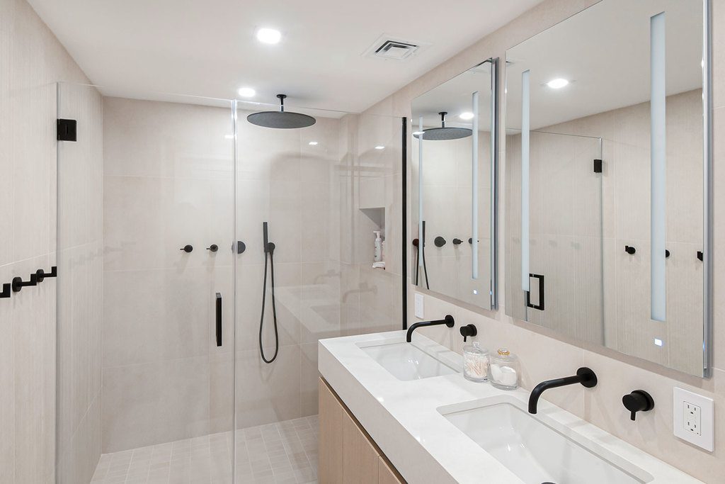
We began by splitting the oversized living room to create a third bedroom. The oversized grand master bathroom was split into two creating a bathroom for the new third bedroom. We were fortunate to have an apartment layout that included large windows which allowed for enough light and air into each of these new room layouts without detracting from the overall look and feel of the space. The home has now grown from a 2-bedroom, 2½-bathroom to a 3-bed with 3½ baths.

Before 
After
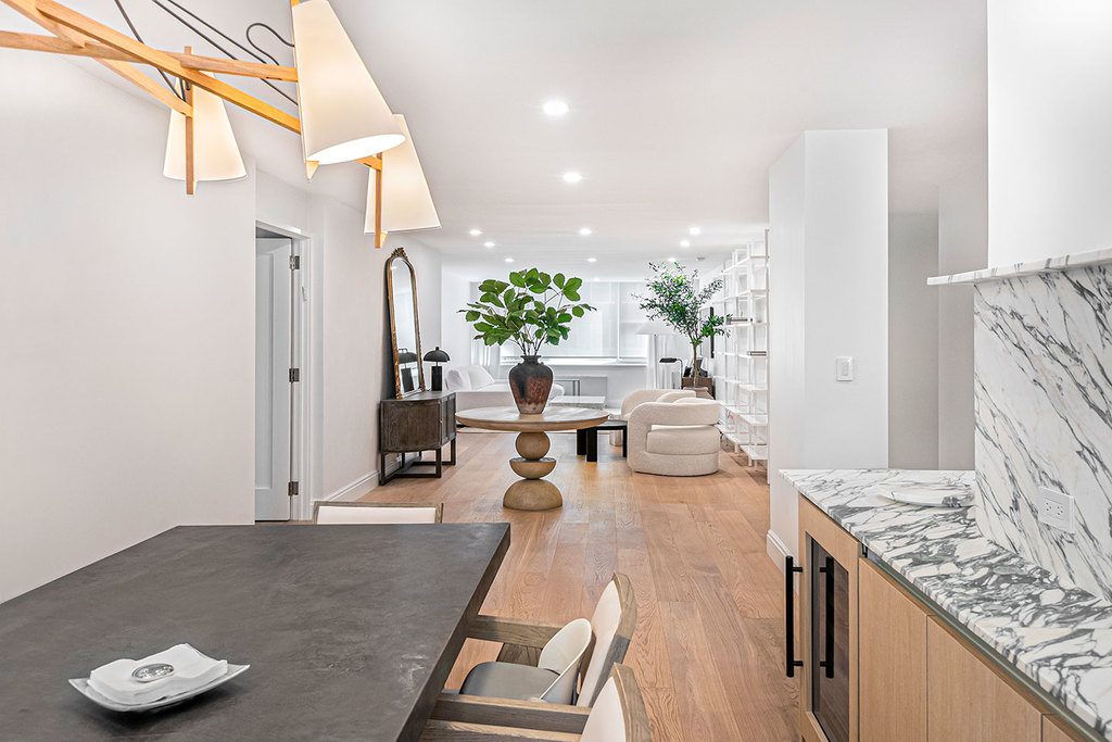
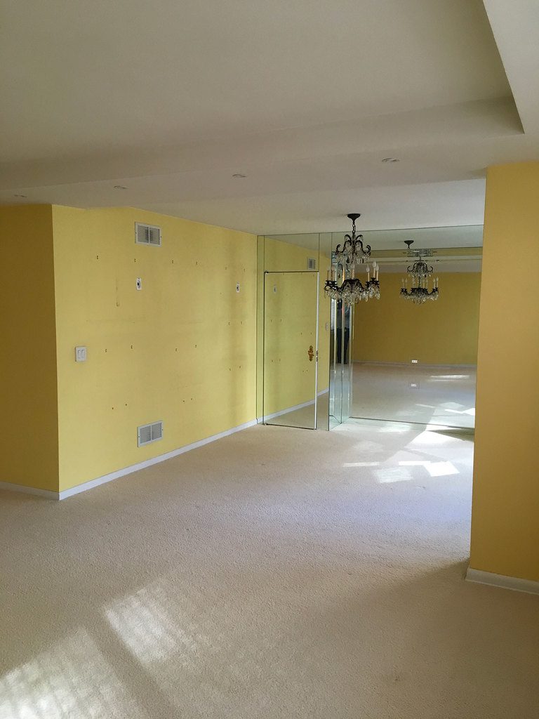
The new spacious feel was further enhanced by removing several walls in the Kitchen, Dining, and Entry Foyer, as well as pushing back the Master Bedroom walls slightly to maximize space in the living rooms. These small changes created an an open-plan design; dropping the ceiling just slightly to allow for recessed lighting and curtain rods allows light and air flows beautifully through the space, without interruption.

Before 
After
Uniform materials were used to make each space feel as large as possible. In the bathrooms, the same color palette and tile selection were used on the floors and walls. In the Kitchen, all appliances were paneled with the same material as the cabinets. Walls, doors, tri and ceilings were painted in the same shade of white, letting the wide planked wood floor and furniture become the features of the rooms.
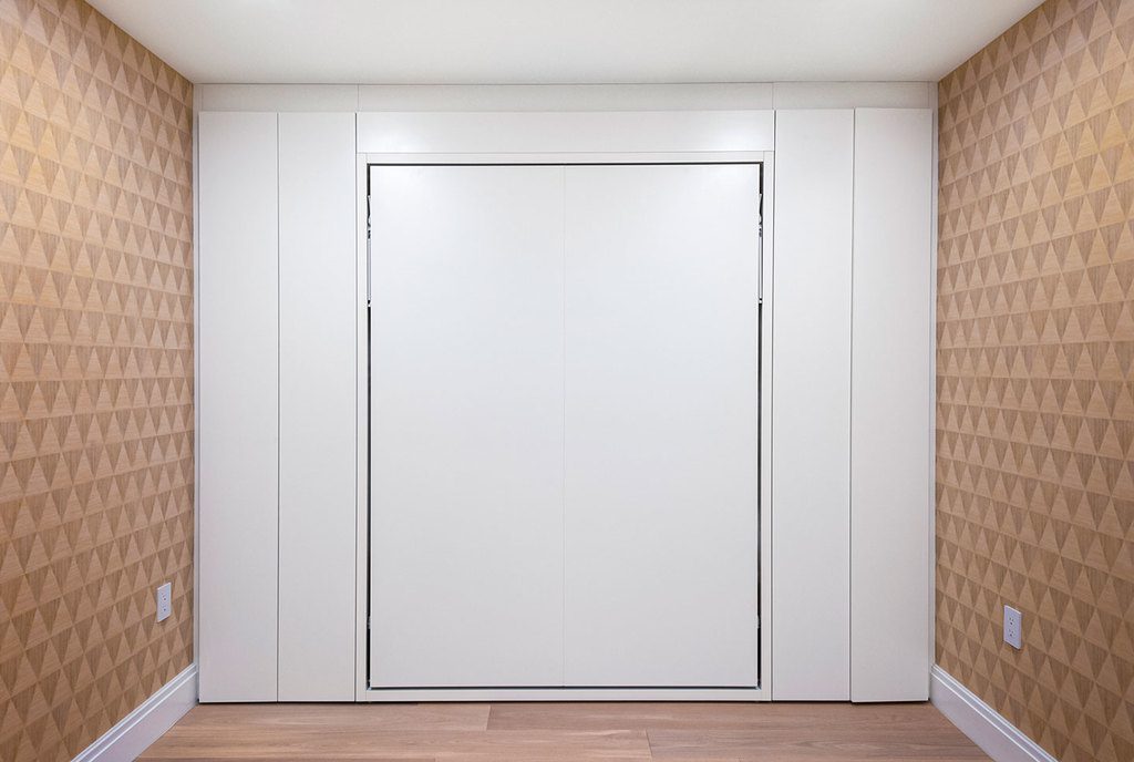
As well as creating new rooms, we embraced the available space as much as we could by installing hidden doors and closets, wherever odd spaces could be utilized for maximum storage. Sliding pocket doors were used to create more usable space within rooms. We focused on creating continuous lines when it came to closets and cabinets – touch latches and recessed drawer pulls were used instead of hardware, and we steered clear of any additional colors and textures within the natural wood cabinet doors, alongside natural wood floors to keep a consistent palette throughout. As a result, we created an incredibly clean and open looking space – without sacrificing storage or functionality – that allows the key fixtures to stand out as main design elements.

Before 
After
The renovation is an amazing transformation from one owner’s aesthetic and lifestyle to another owner’s aesthetic and lifestyle. We are delighted by the final results, and what was accomplished with the restricted timeline of the project.


